Navigating Market Headwinds
Highlights
We believe:
- In our January 2022 Market Outlook, we expected a correction in the first half of the year, and we continue to expect a stronger second half of the year
- Inflation has been persistently higher than policymakers have expected, resulting in the Fed taking a more hawkish stance
- Over time, market returns follow earnings, and earnings are still growing
- For fixed income investors, the transition to higher rates is challenging, which highlights the importance of tactical and active management
- The U.S. economy is slowing, but we believe there is no immediate risks of a recession in 2022
Recession or Growth Scare?
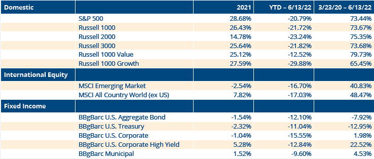
The equity markets had a tremendous three year run from 2019 — 2021, with the S&P 500 averaging a 26% annual gain over the three years, while the Russell 2000 averaged 20% and the MSCI All Country World ex-US averaged a 13.2% return. As shown in Figure 1 below, the gains were even sharper from the March 2020 COVID lows through June 13th, 2022, with the major equity indices in the U.S. posting 70% plus total returns, even after this year’s bear market correction.
Figure 1: Consolidation or Something Bigger
In our annual Market Outlook for this year, we stated, “we think we are transitioning from a year of recovery in 2021 to a year of headwinds and mean reversion in 2022. This year is a mid-term election year and history suggests a choppy first half of the year followed by a second half recovery. We expect to see more volatility this year than last, with the potential for a 10-15% correction in the first half of the year.”
Coming into the year, there were a lot of risks that we highlighted including additional COVID variants, lofty valuations, the potential for a Fed policy error, the mid-term elections in November, and geopolitical risks with China and Russia. We are halfway through the year and those risks are still present.
We did get the correction in the first half of the year that we expected. In fact, it went a little deeper than our forecast, with the major U.S. stock indices falling into bear market territory. As far as economic growth and inflation goes, we still expect the economy to post continued growth this year and for inflation to moderate in the second half of the year. June’s Consumer Price Index (CPI) report does indicate, however, that inflation has been stickier than most people and policymakers thought.
The market’s focus has shifted somewhat from inflation fears, which are still very present, to concerns over a looming recession. However, at this point, we believe the weight of the evidence still supports continued economic expansion. Gross Domestic Product (GDP) did contract by 1.5% in the first quarter following a 6.9% expansion in the fourth quarter.
We believe there is a lot downward pressure on the economy including: stocks declining, mortgage rates rising causing housing affordability to plunge, federal outlays decreasing significantly, consumer sentiment plunging to a record low, the Fed’s balance sheet rolling off, and M2 money supply slowing.
There are positives too, though. Employment is strong, but is beginning to moderate. Nominal wages and salaries increased at a 10% quarter-over-quarter annual rate in Q1. Additionally, real consumer spending increased at a 3% annual rate in Q1 and is on track to increase 5% in Q2, the Index of Leading Economic Indicators recently made new highs, and the yield curve (10-year Treasury minus 3-month bills) continues to steepen.
The U.S. economy is slowing, but we believe an immediate recession is not evident in these indicators. However, we believe the chance of a future recession is on the rise given tightening financial conditions including the decline in stocks, higher interest rates, and a strong U.S. dollar. At this point in time, it looks like we are in the midst of a growth scare.
Economic Indicators Suggest Slowing, but Growing Economy
As shown in Figure 2 below, the 40% surge in the M2 money supply over the past two years helps explain why nominal GDP had a massive surge, with total U.S. economic output hitting new highs. There has been no contraction in nominal GDP as the economy has powered ahead to record levels.
Figure 2: U.S. Economic Output Reaches New Highs After Surge in M2 Money Supply
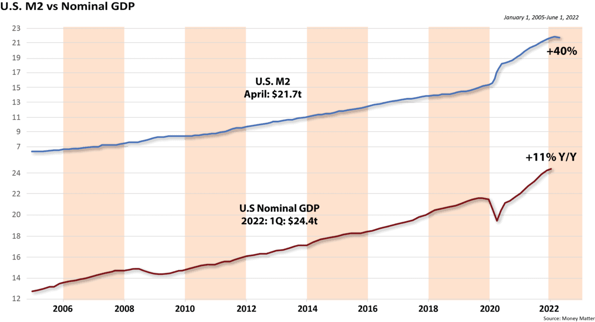
For illustrative purposes only. Past performance is not indicative of future results.
In 1923, Keynes said, “on average, the rate of change of the money supply has reached its peak nearly 16 months before the peak in general business.”
Let’s look at some more economic statistics. The U.S. labor market is normalizing as labor supply is released and workers feel less tempted to leave their current positions in search of new ones. When unemployment is low, jobs growth tends to moderate. The trend in employment has clearly been slowing. Over the last three months, the rate of monthly employment growth in both the Household and Establishment surveys has slowed to levels not seen in a year.
Also, over the past two months, the four-week average of unemployment claims has increased by 45,000. That fits in with the cooling of the labor markets, and indicates at a minimum a flattening out of the jobless rate. This normalization of the labor market will, over time, take pressure off wage inflation.
As we said at the outset of this year, we do not expect a recession in 2022. Risks do increase for 2023, largely as a result of Fed tightening, uncertainty about supply chain issues, and geopolitical developments. Given that strong real GDP growth last year was supported by extraordinary fiscal and monetary policy measures, both of which have now turned hawkish, a slower pace of expansion this year was practically assured.
Many leading indicator indices that we follow including the Conference Board’s Leading Economic Indicators, the OECD Composite Leading Indicator (CLI), and the Economic Cycle Research Institute’s Weekly Leading Index, are running above trend, consistent with continued expansion over the near term.
Shown below in Figure 3 is the Conference Board’s Index of Leading Economic Indicators (LEI), which paints a picture of continued, but slower economic growth. The index hit an all-time high in March, but fell 0.3% in April.
Figure 3: LEI Suggests Continued Expansion
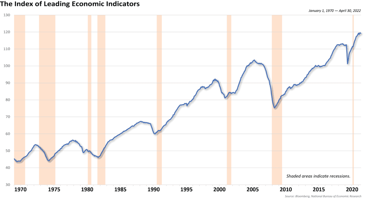
For illustrative purposes only. Past performance is not indicative of future results.
The recent high in Leading Indicators is important because over the past 60 years, early weakness in the LEI has preceded every recession in the U.S. The typical lead time between the peak in LEI and the start of recessions has ranged between 4 and 21 months. Since 1960, the average lead time has exceeded 11 months. The LEI even peaked 7 months prior to the COVID recession. The fact that the index recently hit new highs suggests the U.S. economy should continue its expansion.
The yield curve, which is the difference between the yield of the 10-year Treasury and 3-month T-bills, has inverted before every recession over the past 50 years. As shown in Figure 4 on the next page, the yield curve recently hit its steepest level since 2015, which is not indicating a recession.
Figure 4: Yield Curve is Not Indicating a Recession
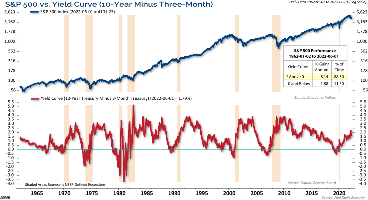
For illustrative purposes only. Past performance is not indicative of future results.
On average, recessions occur about 12-18 months after the yield curve inverts. The sequencing we see with the yield curve leading up to recessions is that the curve inverts and then, the inversion peaks or it gets to its deepest point. After that, the curve steepens, and then the recession starts, normally after it is back into positive territory as was the case with both the 2008 and 2020 recessions. The normal sequencing of the yield curve that typically leads to a recession hasn’t begun.
Volatility is Normal
Corrections and bear markets happen a lot more frequently than most investors believe. On average, the S&P 500 has experienced three 5% corrections a year, a 10% decline once a year, a 15% decline every two years, and a 20% or greater bear market every three years.
The market had not suffered a 10% correction or larger since the COVID lows until now. Now, the market has experienced its first 20% decline since the COVID meltdown. How much further down does the market have to go? We believe that largely depends on the economic outlook, inflation, and how hawkish the Fed gets hiking rates. As far as levels, 3500 on the S&P 500 is the 50% retracement of the entire rally off of the March 2020 COVID lows. Since the May lows broke on June 10th, that puts 3500 as a new potential downside target.
From our observation, the volatility that we have experienced this year is not too abnormal given the long-term historical perspective and the normal declines seen during a mid-term election year.
Figure 5: Bear Markets Not Accompanied by Recession Are Milder

For illustrative purposes only. Past performance is not indicative of future results.
Figure 5 above shows the declines over 10% in the Dow Jones Industrial Average (DJIA) and whether they were accompanied by a recession. This chart shows that bear markets not accompanied by a recession are milder than those associated with a recession. For example, the average bear market declines for the DJIA with no recession have been 25% and have lasted 7 months, versus the bear markets during a recession suffering an average 35% loss lasting over 12 months.
We believe this data supports our base case of no immediate recession, and our expectations of a recovery in the second half of the year.
A Second Half Rebound?
Extremes in investor sentiment are normally contrarian indicators, with optimistic sentiment leading to corrections or pullbacks, and pessimistic extremes leading to rebounds. According to the American Association of Individual Investors (AAII), the percent of individual investors that were bullish dropped to its lowest level since the Global Financial Crisis. It has recovered some since those depressed levels but is nowhere near an optimistic extreme and it is still below its historical average of about 38%.
We believe it’s not just sentiment on the market, but also sentiment towards the economy, which is very depressed. Inflation concerns have caused extremely negative sentiment readings, and it’s hard to imagine these readings getting too much worse as there’s a floor in terms of how low they can go. Therefore, barring a significant negative shift in the economy, this would suggest a higher likelihood of positive surprises than downside surprises at this point, and any cooling on the inflation front should result in a bounce-back for sentiment (and potentially the stock market).
Figure 6: Sentiment Suggests Potential Rebound
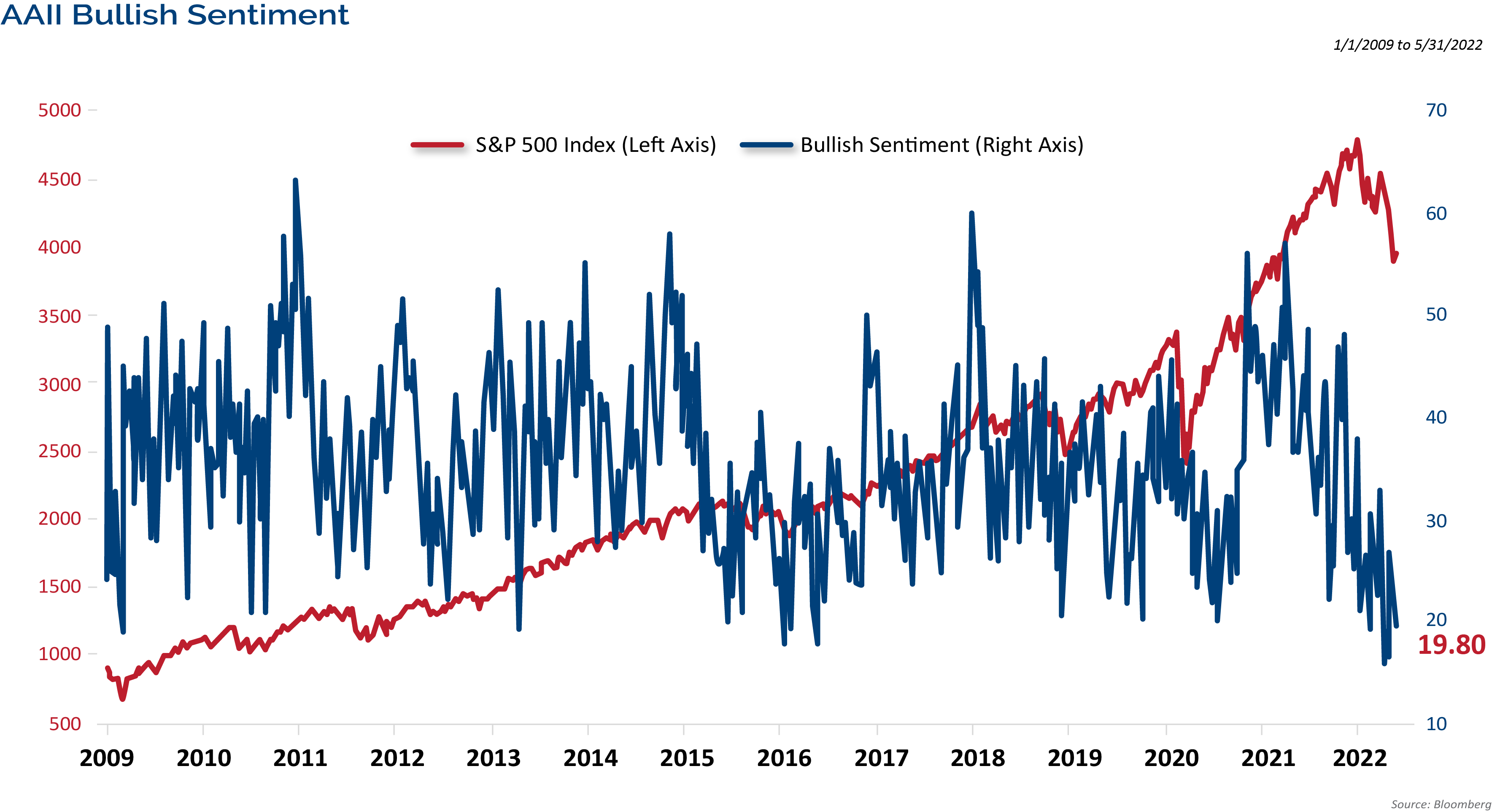
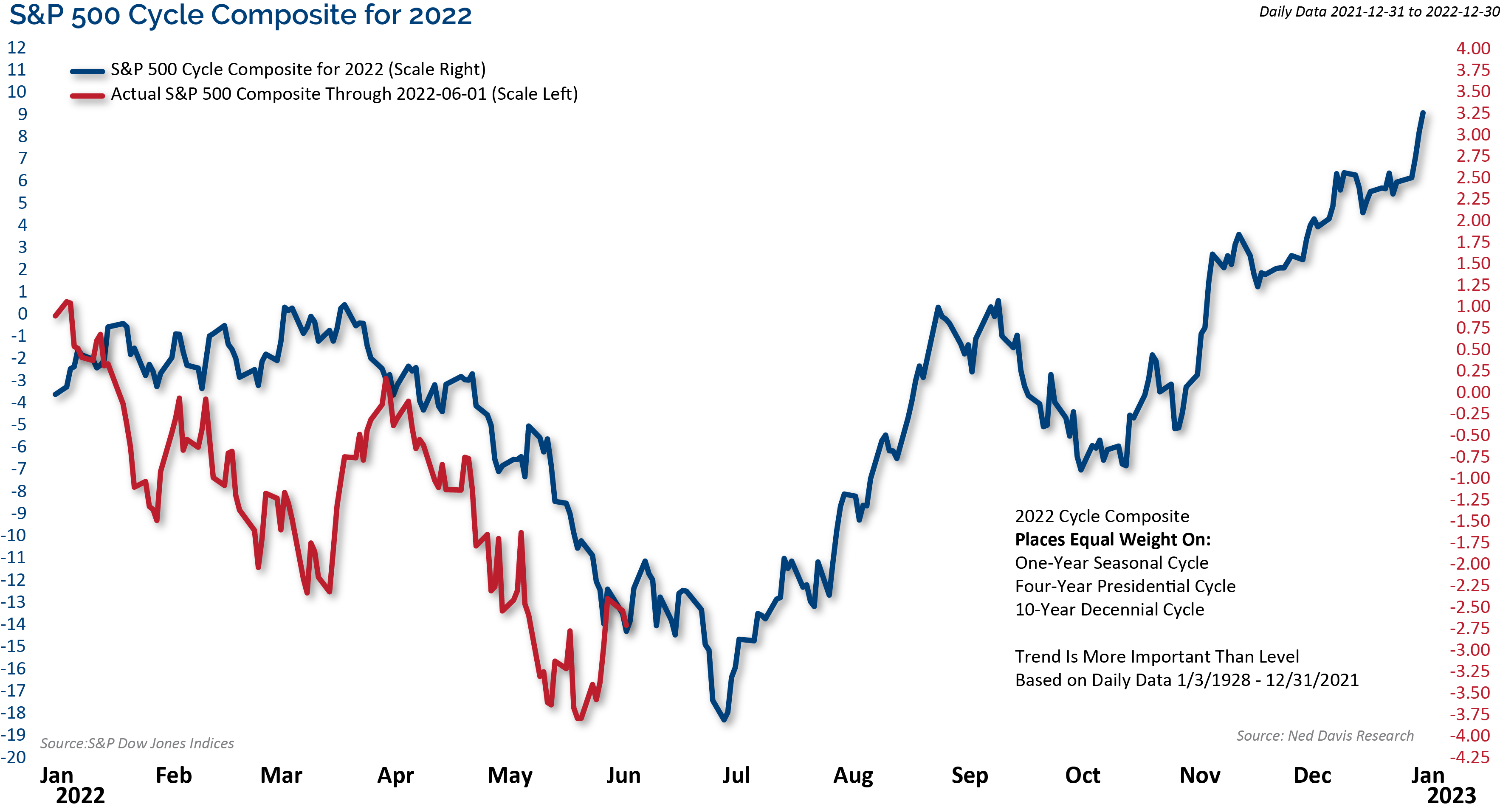
Figure 7: Cycle Composite Suggests Improvement for Second Half of the Year
For illustrative purposes only. Neither past actual, projections or other forward looking statement regarding future financial performance of markets are only predictions and actual events or results may differ materially.
Figure 7 above shows the Ned Davis Research Cycle Composite for this year. It combines the one-year cycle, four-year cycle (election years), and decennial cycle into a single composite. We use the Cycle Composite as a guide to how the market may trade directionally throughout the year.
The Cycle Composite suggested a weak first half of the year followed by a strong rebound in the second half. The Composite is aligned with the normal mid-term election year trends, which also suggested a weak first half, followed by a strong rebound in the second half of the year. These were both factors that led us to expect a 15% correction in the first half. Whether the lows are in or not, the cycle composite suggests the possibility of an improving tape as we move through the summer.
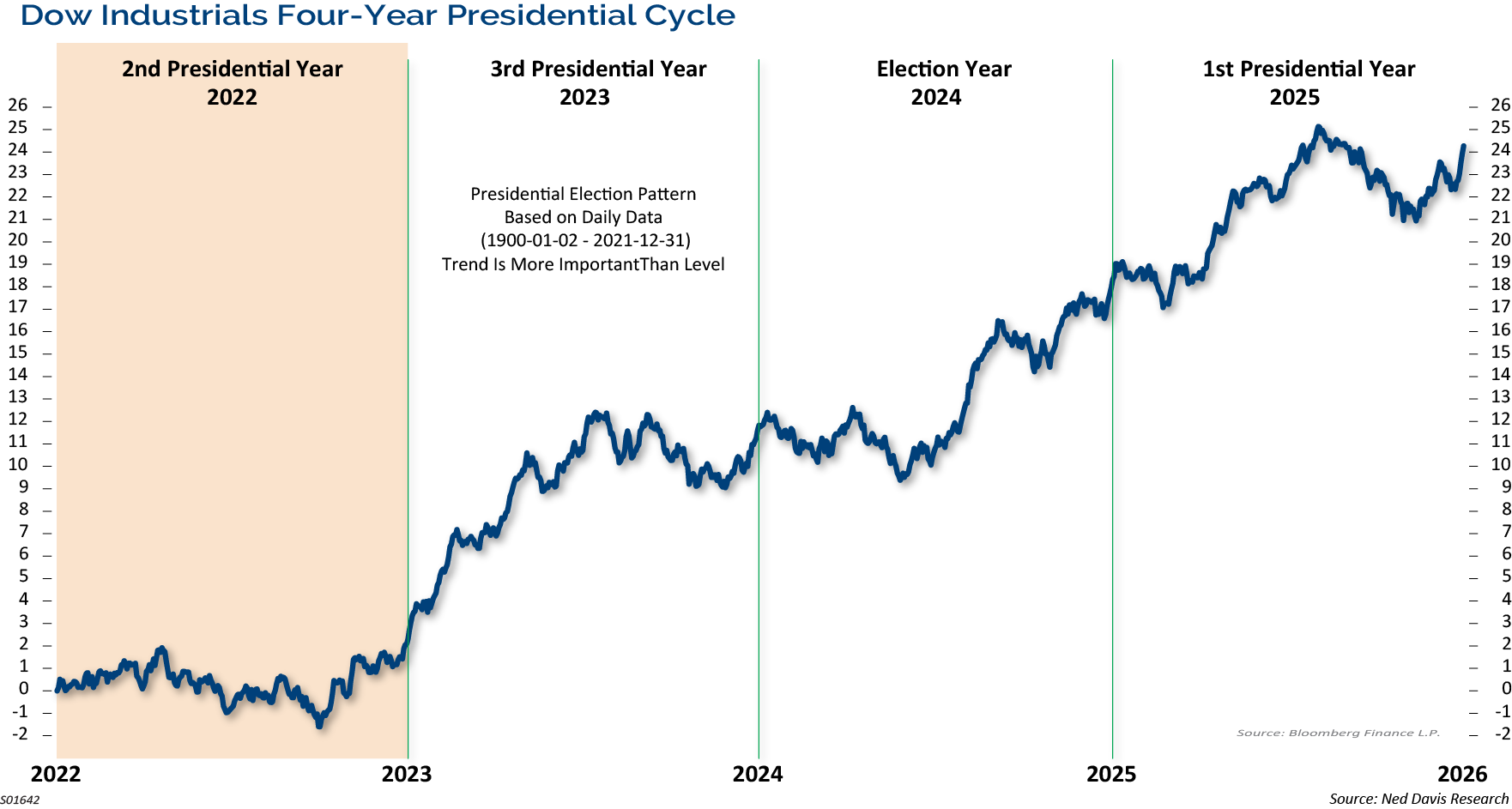
Figure 8 below graphically shows the historical trend of the market during the four years of the Presidential Cycle, dating back to the early 1900s. We are currently in the second year of the term, which is the mid-term election year. The second year of the President’s term has historically been mediocre for the equity markets. In the post-WWII era (since 1948) the mid-term year has posted an average price gain of 6.0%, which is the smallest average gain for the S&P 500 of all of the four years of the term.
Figure 8: Mid-Term Election Year Trends Support Second Half Recovery
For illustrative purposes only. Past performance is not indicative of future results. Projections or other forward looking statements regarding future financial performance of markets are only predictions and actual events or results may differ materially.
The horizontal shaded zone from about the middle of the first year of the term into mid-term elections shows that historically, the market normally trades in a sideways consolidation, with the potential for decent corrections leading up to the mid-term election. Sounds familiar.
We have studied every mid-term election year since 1934, the corrections into the mid-term market lows, and the rebound rallies following those lows. History shows us that the market has endured a 21% correction on average into the mid-term election year lows. The silver lining to this is that the market has also historically rebounded very strongly from those mid-term lows into a high the very next year. The average gain from the mid-term low to the high point in the following year is almost 47%. Naturally, the years accompanied by a recession have had steeper declines, 31% on average, than those with continued economic growth, which are 17% on average.
Gains from the mid-term election year low into its year-end have averaged 21%. We believe this supports a second half recovery once the market bottoms.
Stock Prices are Falling, but Earnings are Still Growing
The selloff removed much of the froth from valuations, with S&P 500 P/E ratios falling close to their long-term averages.
Stock prices have taken a tumble, but reported earnings haven’t, yet. The combination of falling stock prices and rising earnings has caused the S&P 500’s P/E ratio to plunge. The P/E ratio is now 18.65, which is below its long-term average.
While the S&P has declined 21% from its high, its valuation metric has plunged almost twice as much, more than 35%. Looking forward from here, the S&P 500’s annualized return when its P/E ratio was more than 35% off its peak was an impressive +19.6%, thanks to large and persistent rebounds following protracted selloffs.
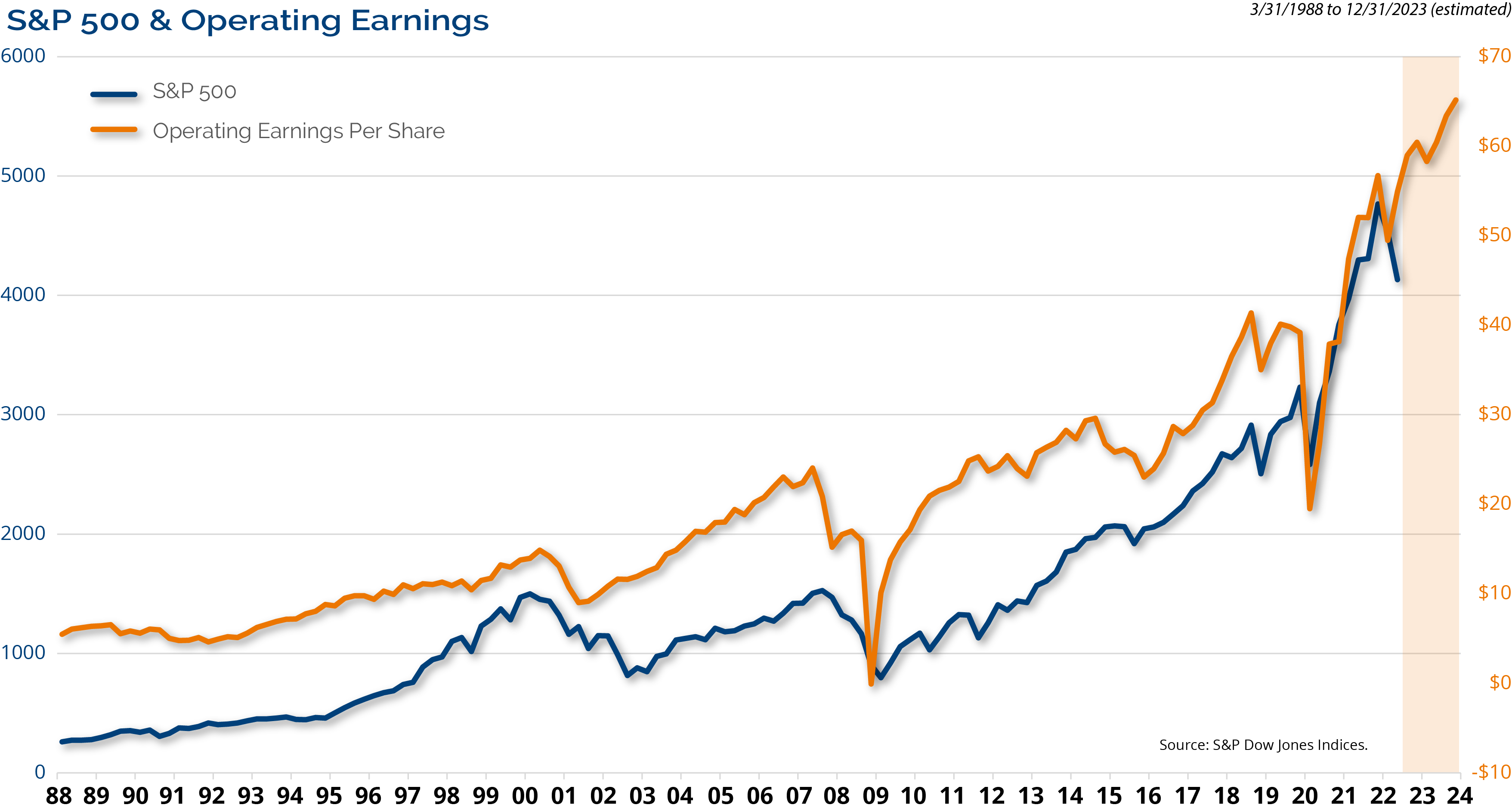
Figure 9: Stock Prices and Earnings Growth are Highly Correlated
For illustrative purposes only. Neither past actual, projections or other forward looking statement regarding future financial performance of markets are only predictions and actual events or results may differ materially.
Over time, market returns follow earnings, as the graph in Figure 9 above shows. Stock prices and earnings growth are very correlated. Higher earnings have led stocks higher and during times of earnings decline, such as the recessions of the early 2000s, 2008, and 2020, stocks have followed suit.
Currently, earnings are still growing. There have been downward revisions to estimates, but analysts expect earnings to grow by 7.5% in 2022 and by 10.5% in 2023. Given the market environment, and slowing economic growth, we expect to see analysts revise earnings estimates down. This could make the valuation picture a little less palatable.
Risks for the Bond Market
Over the past several years, we have said that we believe it’s important to be active and tactical in fixed income due to the many risks facing the fixed income markets. The 10-year Treasury Note yield has been in decline since the early 1980s. Each peak in yield was followed by a lower high and new lows. That trend is now in jeopardy, with the yield exceeding its late 2018 highs. This puts the long-term, secular bull market in bonds at risk. It doesn’t mean that rates need to continuing climbing in the short-term, but the secular winds may be changing.
That’s OK for bond investors as a more normal yield curve and level of yields would be healthy for the market and investors. Over the long run, the total return of bonds depends far more on income, and reinvested income, than it does on changes in prices. Since 1976, the inception of the Aggregate Bond Index, just over 90% of the average annual return of the U.S. bond market has come from interest and reinvested income. While the transition to higher rates is challenging, fixed income investors should welcome higher rates.
Is Peak Inflation Here?
Figure 10: Recent Inflation Numbers Suggest Continued Rate Hikes
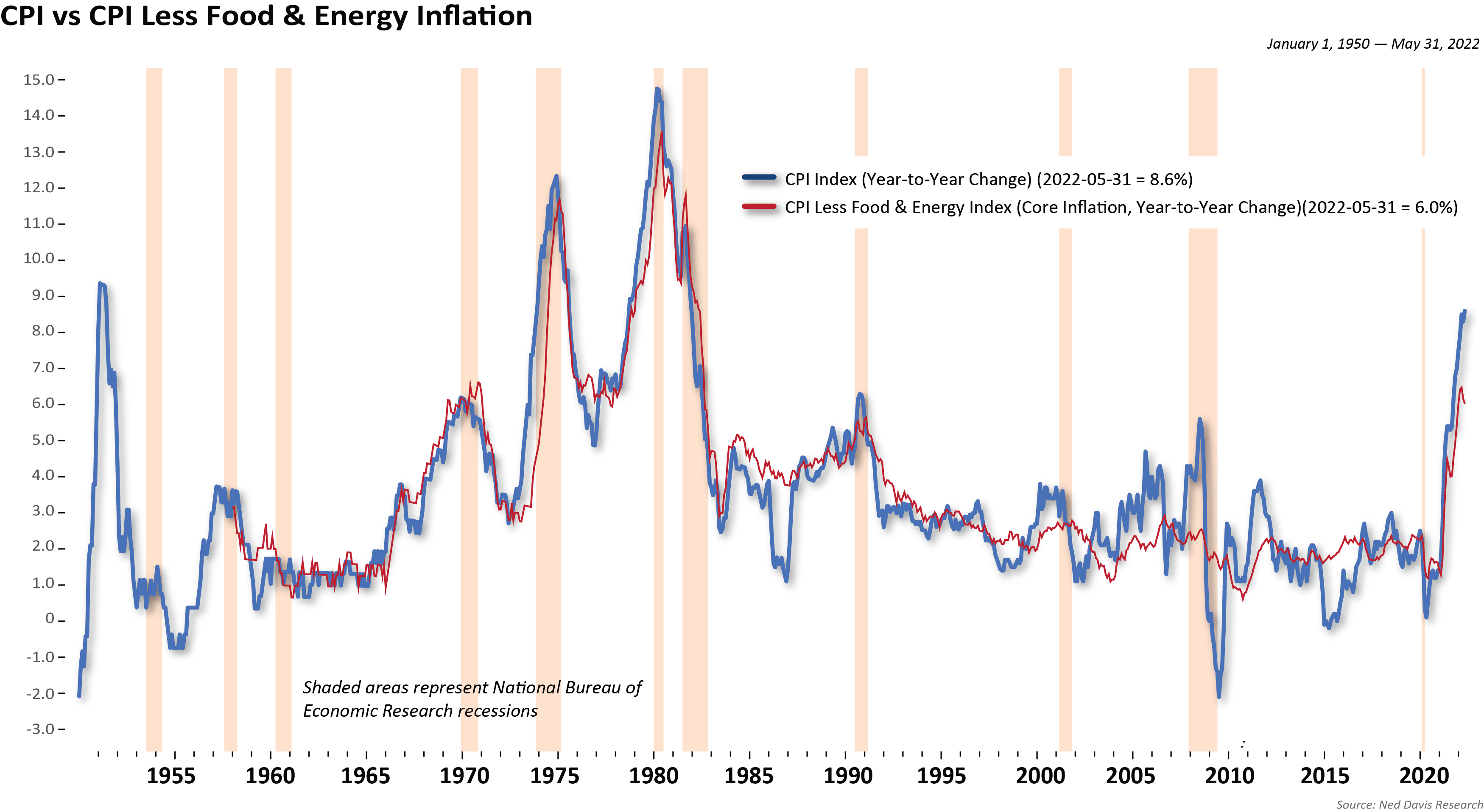
For illustrative purposes only. Past performance is not indicative of future results.
Inflation…or too much money chasing too few goods. From our observation, too much monetary and fiscal stimulus for too long, as well as supply chain disruptions, has equaled a nasty bout of inflation.
The May Consumer Price Index (CPI) report surprised to the upside, hitting a fresh 40-year high of 8.6% year-over-year. The core rate also rose to 6% year-over-year. Those figures solidify expectations that the Fed will continue hiking rates on an aggressive path.
Everybody is looking for peak inflation. It has been elusive so far this cycle, but we do expect inflation to moderate in the second half of the year for a few reasons. First, the labor markets are cooling and wage gains have started to moderate. Average hourly earnings rose just 0.3% in both April and May, which is a 3.8% annual pace, sharply down from the pace of wage growth for most of last year.
Other than food and energy costs, commodity inflation is also easing. Lumber has declined 63% from its recent peak and industrial metals are off 23% from their peak. Shipping costs and delay times have also come down and we have begun to see a shift in the makeup of inflation, from the inflation of goods to the inflation of services. We expect that trend to continue as consumers shift their buying habits from buying “stuff” to buying experiences.
Moderating consumer durable goods inflation will be partially offset by rising prices of gasoline, groceries, and rent. Inventories have picked up across a range of consumer goods at a time when consumers are demanding less of these items. The increase in the U.S. dollar should also play a role in pushing prices down for imported consumer goods. In addition, base effects and easing supply chain pressures should lower the inflation rate in the coming months.
All Eyes on the Fed
Figure 11: Stocks Gain from Fed’s Growing Balance Sheet
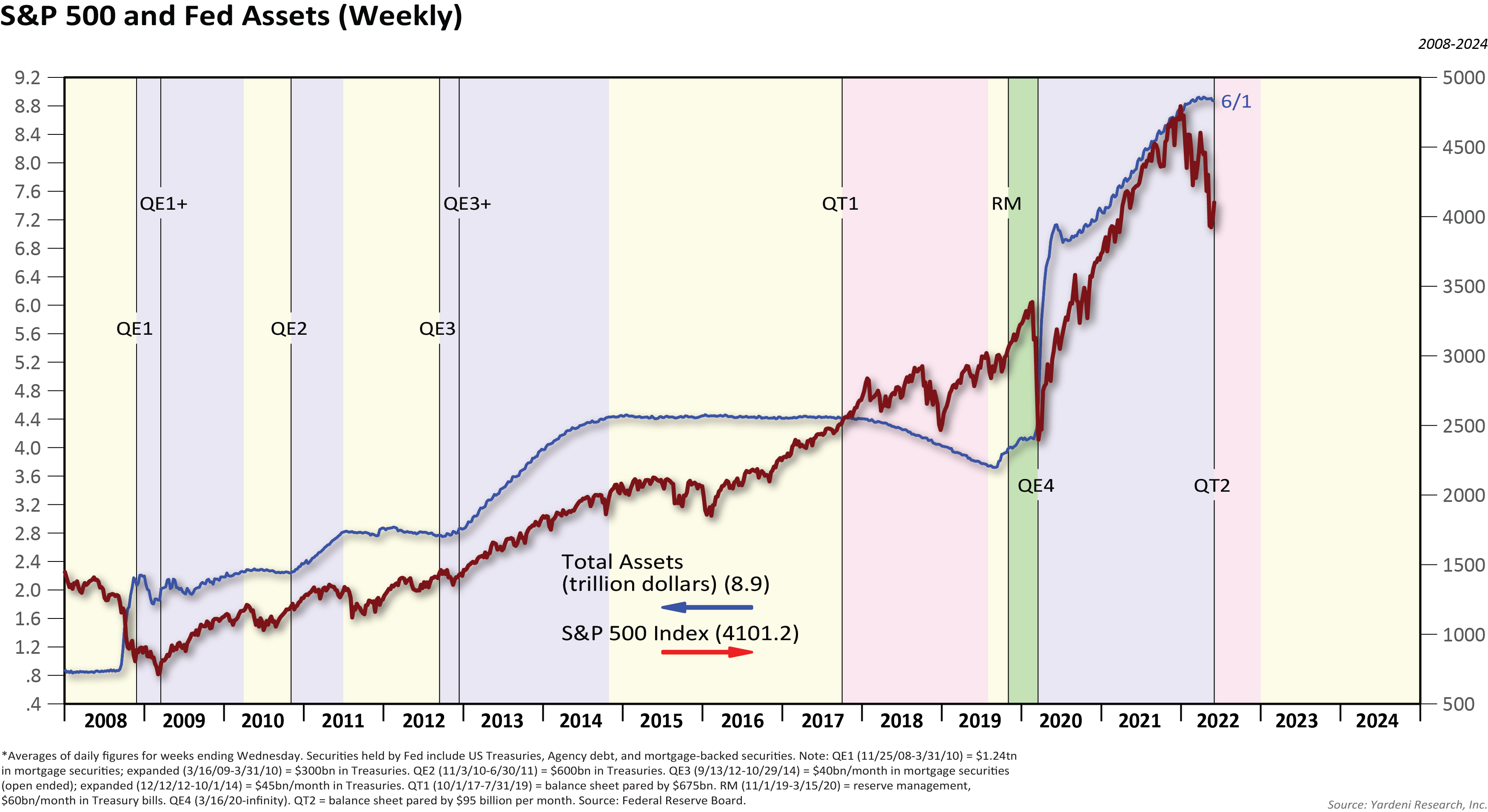
For illustrative purposes only. Past performance is not indicative of future results. Neither past actual, projections or other forward looking statement regarding future financial performance of markets are only predictions and actual events or results may differ materially.
Figure 11 above shows the Fed’s balance sheet and the S&P 500. Virtually all of the gains in stocks since 2008 have occurred while the balance sheet was growing. Before the Global Financial Crisis, the Fed’s balance sheet stood at about $800 billion. It is now $8.9 trillion. The Fed’s balance sheet has doubled, up over $4 trillion, since the beginning of COVID. There is no way the Fed can reduce the size in a meaningful way without disruption. Yet, they are going to try. In our January Market Outlook, we said that a question that central banks will have to answer is, “How do they exit extreme stimulus without disrupting financial stability?”
The Fed is staging a balance sheet runoff. Initially, the Fed will reduce its balance sheet by $47.5 billion per month through August, and then step it up to $95 billion per month after that, totaling about $1.3 trillion over 15 months. That is a lot of liquidity being pulled out of the system.
It is possible that the financial markets have discounted much of the Quantitative Tightening (QT) already. Now, given that the Fed has laid out their plan, with no end date offered to the runoff, at what point will the Fed blink? In 2018, they ended QT after the markets sold off sharply. This is something that we will be watching closely.
Credit Fundamentals Have Improved
Figure 12: High Yield Credit Spread Near its 22-Year Average
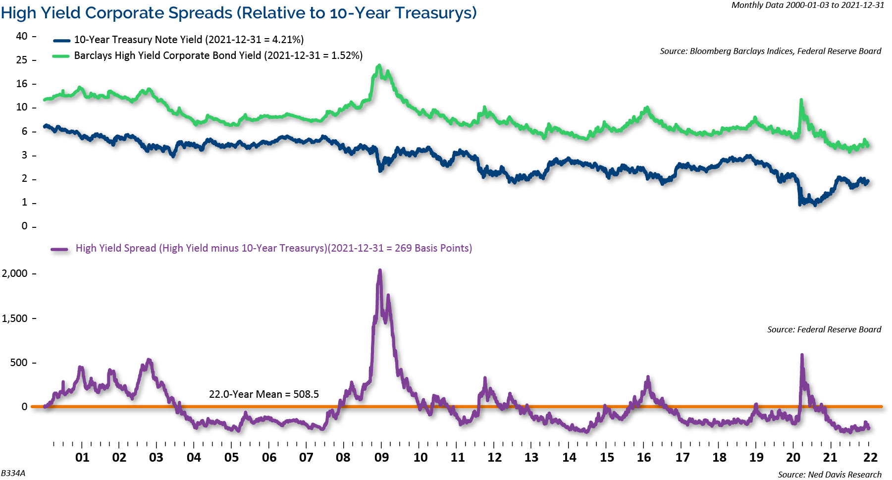
Credit spreads have begun to move higher with an overall shift in interest rates. As shown in Figure 12 above, the high yield credit spread is near its 22-year average.
We believe that high yield has become a lot more attractive recently, with the yield on the High Yield Index at 8.43% currently. With the exception of the COVID collapse in March 2020, those are the highest yields since 2015/2016. While there are short-term risks given the downside momentum, we believe high yield looks attractive once credit spreads start coming back in.
In addition, balance sheets remain in one of their strongest positions of the past twenty years. Overall, this leaves us comfortable with a benign default picture, even if a mild recession occurs (again, not our base case), we see default rates of only 1.9% for this year, comfortably below the long-run average of 4%.”
Overall, we believe that credit fundamentals have improved markedly during the economic recovery. Companies have decreased their leverage to their lowest level since pre-2000 and interest coverage ratios have surged to their highest level in over 50-years. We believe the declines we are seeing in corporate bonds are primarily driven by interest rates moving higher, and not by credit stress.
Dividends Matter
Figure 13: Dividend Growers Continue to Outperform Other Stock Categories
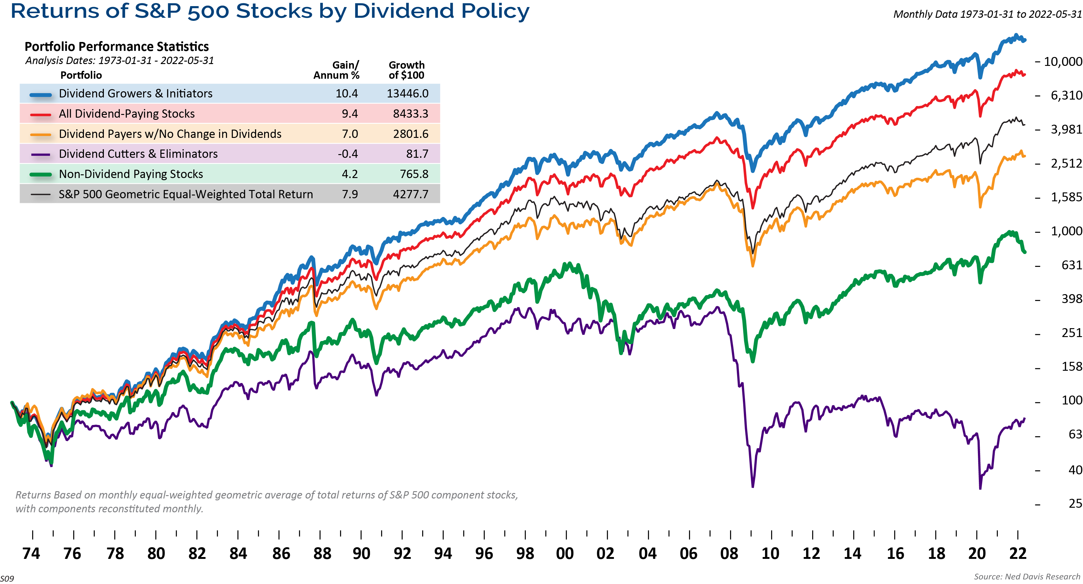
Dividends matter. As Figure 13 above shows, over time, stocks that pay a dividend, in addition to growing their dividends, have outperformed other categories of stocks including dividend payers, dividend cutters, and non-dividend stocks.
In order for a company to pay and grow their dividends over time, it must generate a consistent earnings stream. In this environment of higher inflation, dividend paying stocks, and dividend growth stocks in particular, we believe it can be a good inflation hedge. In fact, dividend growth stocks have continued to outperform even during the tumultuous year we have had so far in the markets.
Conclusion
We have concluded the past several Market Outlook calls with this chart of the very long-term perspective of the equity markets.
Figure 14: Secular Bull Market Continues

For illustrative purposes only. Past performance is not indicative of future results.
The above chart of the S&P 500 in Figure 14 dates back into the 1920’s. The three boxes in red highlight the last three secular bear markets. Note that once the market eclipsed its prior secular peak, it continued higher for many years. The prior two secular bull runs lasted 22 and 18 years. In our opinion, we are still in the secular bull market that began after the Credit Crisis.
This year has been very challenging and frustrating for investors. We expected a decent correction in the first half of the year, and we continue to expect a stronger second half of the year. Inflation has been persistently higher than policymakers have expected, and therefore the Fed is taking a hawkish stance. As it stands now, we think we are in a growth scare, and if the economy doesn’t fall into recession, then the market has already discounted a large amount of the slowdown.
As always, we believe that clients should be focused on their long-term goals and objectives, and should not be derailed by short-term swings in the markets.
Eager for More Insights? Visit our 2022 Mid-Year Market Outlook Resource Center.
The opinions expressed are those of Clark Capital Management Group. The opinions referenced are as of the date of publication and are subject to change due to changes in the market or economic conditions and may not necessarily come to pass. There is no guarantee of the future performance of any Clark Capital investment portfolio. Material presented has been derived from sources considered to be reliable, but the accuracy and completeness cannot be guaranteed. Nothing herein should be construed as a solicitation, recommendation or an offer to buy, sell or hold any securities, other investments or to adopt any investment strategy or strategies. For educational use only. This information is not intended to serve as investment advice. This material is not intended to be relied upon as a forecast or research. The investment or strategy discussed may not be suitable for all investors. Investors must make their own decisions based on their specific investment objectives and financial circumstances. Past performance does not guarantee future results.
This document may contain certain information that constitutes forward-looking statements which can be identified by the use of forward-looking terminology such as “may,” “expect,” “will,” “hope,” “forecast,” “intend,” “target,” “believe,” and/or comparable terminology (or the negative thereof). No assurance, representation, or warranty is made by any person that any of Clark Capital’s assumptions, expectations, objectives, and/or goals will be achieved. Nothing contained in this document may be relied upon as a guarantee, promise, assurance, or representation as to the future.
Clark Capital Management Group, Inc. is an investment adviser registered with the U.S. Securities and Exchange. Commission Registration does not imply a certain level of skill or training. More information about Clark Capital’s advisory services can be found in its Form ADV which is available upon request.
The Barclays U.S. Corporate High-Yield Index covers the USD-denominated, non-investment grade, fixed-rate, taxable corporate bond market. Securities are classified as high-yield if the middle rating of Moody’s, Fitch, and S&P is Ba1/BB+/BB+ or below.
Index returns include the reinvestment of income and dividends. The returns for these unmanaged indexes do not include any transaction costs, management fees or other costs. It is not possible to make an investment directly in any index.
Fixed income securities are subject to certain risks including, but not limited to: interest rate (changes in interest rates may cause a decline in market value or an investment), credit, prepayment, call (some bonds allow the issuer to call a bond for redemption before it matures), and extension (principal repayments may not occur as quickly as anticipated, causing the expected maturity of a security to increase).
Non-investment-grade debt securities (high-yield/junk bonds) may be subject to greater market fluctuations, risk of default or loss of income and principal than higher-rated securities
The S&P 500 measures the performance of the 500 leading companies in leading industries of the U.S. economy, capturing 75% of U.S. equities.
The Russell 1000 Value Index measures the performance of the large-cap value segment of the U.S. equity universe. It includes those Russell 1000 companies with lower price-to-book ratios and lower expected growth values.
The Russell 1000 Growth Index measures the performance of the large-cap growth segment of the U.S. equity universe. It includes those Russell 1000 Index companies with higher price-to-book ratios and higher forecasted growth values.
The Russell 1000 Index measures the performance of the large-cap segment of the U.S. equity universe. It is a subset of the Russell 3000® Index and includes approximately 1000 of the largest securities based on a combination of their market cap and current index membership. The Russell 1000 represents approximately 92% of the U.S. market.
The Russell 2000 Index measures the performance of the 2000 smallest U.S. companies based on total market capitalization in the Russell 3000, which represents approximately 10% of Russell 3000 total market capitalization.
The Russell 3000 Index measures the performance of the 3000 largest U.S. companies based on total market capitalization, which represents approximately 98% of the investable U.S. equity market.
The MSCI Emerging Markets Index is a free float-adjusted market capitalization index that is designed to measure equity market performance of emerging markets. The MSCI Emerging Markets Index consists of the following 21 emerging market country indices: Brazil, Chile, China, Colombia, Czech Republic, Egypt, Hungary, India, Indonesia, Korea, Malaysia, Mexico, Morocco, Peru, Philippines, Poland, Russia, South Africa, Taiwan, Thailand, and Turkey.
The MSCI World ex US Index is a market capitalization-weighted index designed to measure equity performance in 22 global developed markets, excluding the United States. The benchmark for this composite is used because the MSCI World Ex US Net Index is generally representative of international equities.
BBgBarc U.S. Aggregate Bond Index covers the U.S. investment-grade fixed-rate bond market, including government and credit securities, agency mortgage pass-through securities, asset-backed securities and commercial mortgage-based securities. To qualify for inclusion, a bond or security must have at least one year to final maturity, and be rated investment grade Baa3 or better, dollar denominated, non-convertible, fixed rate and publicly issued.
The BBgBarc US Treasury Index measures US dollar-denominated, fixed-rate, nominal debt issued by the US Treasury. Treasury bills are excluded by the maturity constraint but are part of a separate Short Treasury Index. STRIPS are excluded from the index because their inclusion would result in double-counting. The US Treasury Index is a component of the US Aggregate, US Universal, Global Aggregate and Global Treasury Indices.
The BBgBarc US Corporate Bond Index measures the investment grade, fixed-rate, taxable corporate bond market. It includes USD-denominated securities publicly issued by US and non-US industrial, utility and financial issuers. The US Corporate Index is a component of the US Credit and US Aggregate Indices, and provided the necessary inclusion rules are met, US Corporate Index securities also contribute to the multi-currency Global Aggregate Index.
The BBgBarc U.S. Corporate High-Yield Index covers the U.S. dollar-denominated, non-investment grade, fixed-rate, taxable corporate bond market. Securities are classified as high-yield if the middle rating of Moody’s, Fitch, and S&P is Ba1/BB+/BB+ or below.
The BBgBarc U.S. Municipal Index covers the USD-denominated long-term tax-exempt bond market. The index has four main sectors: state and local general obligation bonds, revenue bonds, insured bonds and prerefunded bonds.
The Global Manufacturing PMI™ indices are all seasonally adjusted. The seasonal adjustment is applied at the national level (as opposed to at the global aggregate level) in order to account for differing seasonal patterns in each of the nations included. Global Manufacturing PMI™ indices are weighted according to national contributions to global manufacturing gross value added. Weights for the global indices are derived from the latest available World Bank data on the gross value added of manufacturing for each of the nations covered. World Bank data on value added are in constant 2010 US$, with all national currencies converted to 2010 US$ by the World Bank using DEC alternative conversion factors.
The NDR Credit Conditions Indices (CCI) are designed to objectively measure credit conditions in the U.S. market, specifically the cost & availability of credit. The index consists of two equal-weighted components and historically evaluates business and consumer credit conditions.
NDR (Ned Daily Research) Daily Trading Sentiment Index is based on the S&P 500 Daily Sentiment Index which shows a short-term sentiment view of the S&P 500 Index
Created by the Chicago Board Options Exchange (CBOE), the Volatility Index, or VIX, is a real-time market index that represents the market’s expectation of 30-day forward-looking volatility. Derived from the price inputs of the S&P 500 index options, it provides a measure of market risk and investors’ sentiments.
The 10-year Treasury note is a debt obligation issued by the United States government with a maturity of 10 years upon initial issuance. A 10-year Treasury note pays interest at a fixed rate once every six months and pays the face value to the holder at maturity.
The Dow Jones Industrial Average is the most widely used indicator of the overall condition of the stock market, a price-weighted average of 30 actively traded blue chip stocks, primarily industrials. The 30 stocks are chosen by the editors of the Wall Street Journal (which is published by Dow Jones & Company), a practice that dates back to the beginning of the century. The Dow is computed using a price-weighted indexing system, rather than the more common market cap-weighted indexing system.
Index returns include the reinvestment of income and dividends. The returns for these unmanaged indexes do not include any transaction costs, management fees or other costs. It is not possible to make an investment directly in any index.
The volatility (beta) of an account may be greater or less than its respective benchmark.
The Consumer Price Index (CPI) measures the change in prices paid by consumers for goods and services. The CPI reflects spending patterns for each of two population groups: all urban consumers and urban wage earners and clerical workers. CCM-672
![]()
